The web site appearance may be controlled at the master customer level (most common) or the web user level (rare). Unless you plan on controlling the appearance for each web user individually, this option found in the web user profile should be left as is. Any change recorded in this web site appearance will cause the system to consider this web user separate from all others under the master customer and any changes made to the master customer web site appearance will not be reflected for this web user.
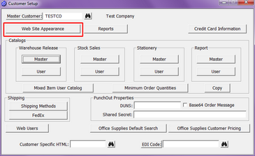
| • | Web Site Appearance – As just mentioned, it is most common to control the web site appearance from the master customer level found on the main Customer Setup dialog. These controls allow the operator to change default titles for catalogs, navigation bar tabs, and reports; as well as all color and font size specifications. |
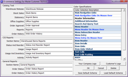
| • | Catalog Text – Controls the default menu description of catalogs. As previously mentioned, most distributors will choose to use whatever name they have assigned the catalog when creating it. This is especially true when more than one catalog of the same type is being made available. This however only applies to Warehouse Release, Stock Sales, and Stationery catalogs. For Office Supplies, Order Approval, Reports, and Order History, this will be the only place you have to control what will be the title on the website. |
| • | CSI Reports – Here you can control both the section title and the title of all CSI reports found within it. In most cases, these titles are left as they default. |
| • | General Reports – Here you can control both the section title and the title of all general reports found within it. In most cases, these titles are left as they default. |
| • | Color Specifications – Used to control the colors and font sizes used throughout the site. In most cases, foreground color will control the color of text, lines, etc. within the area, background will control the color of the areas background, and font size will control the size of the font within the area. |
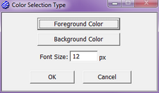
| ◆ | Main Navigation Links – Governs the icon areas found on the navigation bar (house, cart, lock). When a gradient is in use (see Menu Subsection Header, below), the background will control the bottom portion of the tab. |

| ◆ | Main Navigation Links On Mouse Over - Governs the icon areas found on the navigation bar (house, cart, lock) when the user mouses over the area or once the area has been selected. When a gradient is in use (see Menu Subsection Header, below), the background will control the bottom portion of the tab. |

| ◆ | Header Information - Governs the color of the title text for the report sections. |
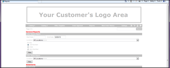
| ◆ | Additional Information - The foreground governs the color of the text in the order history order details section. The background controls the color of the background in order details section. |
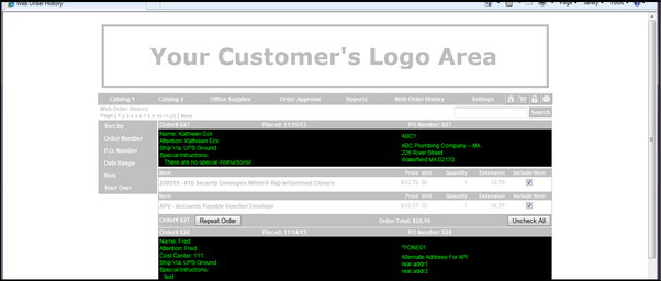
| ◆ | Search And Query Text – Governs the search box area. This usually remains consistent; a dark color for the foreground (typically black or dark gray) and a light color for the background (typically white). While the font size may be adjusted here, typically it is kept as defaulted. Significant change in font size may cause the search box to be over- exaggerated and could cause issues in certain browsers. |

| ◆ | Menu Header – Governs the catalog and page tabs of the navigation bar and side menus. When a gradient is in use (see Menu Subsection Header, below), the background will control the bottom portion of the tab. |

| ◆ | Menu Header On Mouse Over – Governs the catalog and page tabs of the navigation bar and side menus when the user mouses over the area or once the area has been selected. When a gradient is in use (see Menu Subsection Header, below), the background will control the bottom portion of the tab. |

| ◆ | Menu Subsection Header – This spec controls any gradient for the Main Navigation Links or Menu Header referenced above. The foreground controls the top portion of the tab when static and the background controls the top portion of the tab when moused over or selected. In this case, the font size is not used. |

| ◆ | Menu Entry – Depending on the HTML configuration used, this governs the menu system that appears below the navigation bar, at times a drop down from the navigation bar when static. |

| ◆ | Menu Entry On Mouse Over – Depending on the HTML configuration used, this governs the menu system that appears below the navigation bar, at times a drop down from the navigation bar when moused over or selected. |

| ◆ | Item Header – Governs the item information header area (i.e. item code, item description, etc.) |
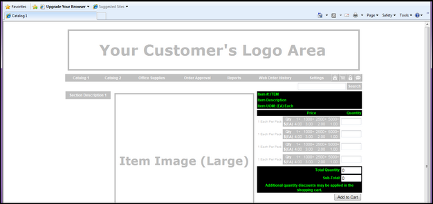
| ◆ | Item Details – Governs all additional item information within an item page. |
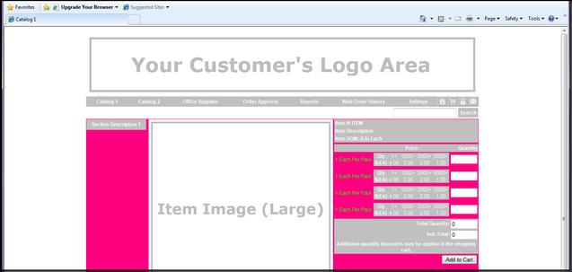
| ◆ | Item Links – Governs any links within item information (typically links to large sample images depending on HTML and catalog types used) when static. |
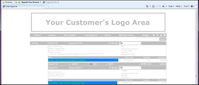
| ◆ | Item Links Visited - Governs any links within item information (typically links to large sample images depending on HTML and catalog types used) when moused over or once selected. |
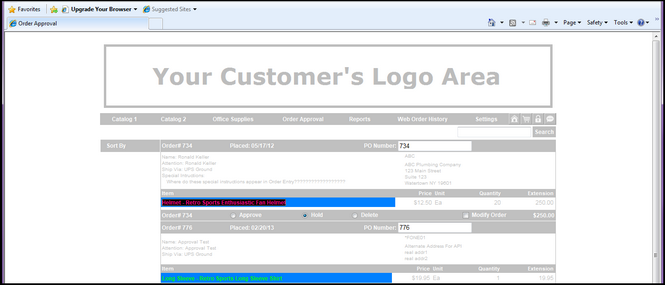
| ◆ | Text Cells – Governs the color of the text line containing order numbers in the order history section. |
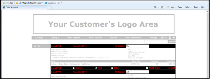
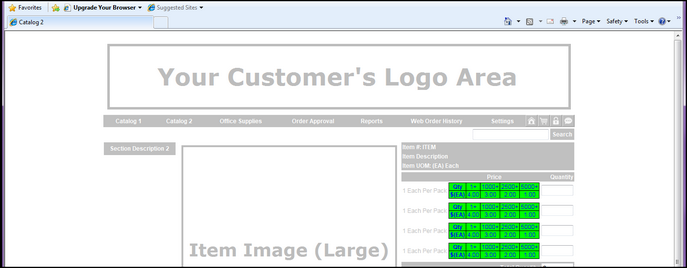
| ◆ | Text Cells Padding – Governs the color of the text in quantity/pricing sections of item descriptions. |
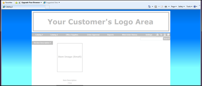
| ◆ | Body – Governs the color of the site’s background as a whole. This includes open areas to the sides, top, and bottom of the pages. There is a gradient inherent with updated HTML and, in this case, the foreground controls the upper most color and the background controls the bottom most color. Often, you may choose to have no gradient. If this is the case, simply make both the foreground and background colors the same. Xebra will prompt you to confirm you wish them to be equal. |
| ◆ | Padding – Not used. |
| ◆ | Error Message Text – Governs any error messages that may be initiated during user entry. Typically, error messages are meant to be bold and recognizable, hence the bright red foreground default. |
| • | Your Company Logo – When in the master customer setup or web user setup, governs the image located in the center of the home page. While many distributors choose to represent their company logo and information, you may use this area for anything you like (customer based image, collage of products available, order instructions). The image provided will be centered at the top of the white center area of the page, just below the navigation bar. For best results, it is suggested that you develop an image no larger than 960 pixels wide with any top padding that you wish to separate the image from the navigation bar. |
| • | Image as catalog link – This image may also be used for navigation purposes. By default, the image provided will be “divided” into equal portions representing the catalogs you have made available; 2 across by as many needed down. For instance, if you have made 5 catalogs available, the image will be “divided” 2 by 3 for 6 unique links. Like reading a book, starting with the upper left most link, you will be directed into the first catalog listed in the navigation bar. The upper right most will direct you into the second, the next link down on the left will direct you into the third, to the right of that will direct you into the fourth, and the link in the bottom left corner will direct you into the fifth. Since there is an odd number, the bottom right link will not be active. It is important, when using this image for catalog navigation that you create an image that takes up the full width of the area (960 pixels), that the image be clearly divided so the end user can easily choose the proper link, and the relationship of the catalog order and image always be maintained. If you should need to remove or add a catalog or change the order in which the catalogs are listed, you will need to update the image accordingly. |
| • | Customer’s Logo – Governs the header image immediately above the navigation bar of each page. It is suggested this image be 960 pixels wide and 100 to 200 pixels high. This is typically used to represent the end user’s logo. |
| • | Save Default Scheme – If you wish, you can take any color scheme you develop and save it as the default color scheme in Default Website Appearance. It will then be used as the default for all newly created websites. As always, you will still have the ability to adjust the appearance on each master customer or web user. |
| • | Load Default Scheme – At any time, you may revert back to the default color scheme found in the Default Website Appearance. Choosing to do so will permanently delete any changes you had previously made. |